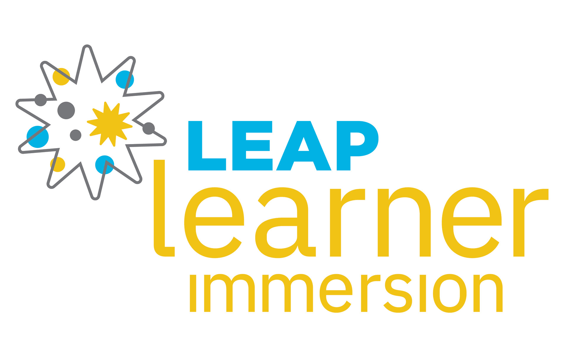
Client: Leap Learner
I was asked to create a sub-brand logo for LEAP LEARNER for one of their products "Leap Learner Immersion" program.
The logo needed to be inspired by the main brand but speak to this particular product in a unique way. I took inspiration from one of the elements —the star — and renamed it "spark" and gave it a fresh point of view and meaning. The "star/spark" represents the catalyst that ignites the unique learning universe for the students and all those in their education universe.
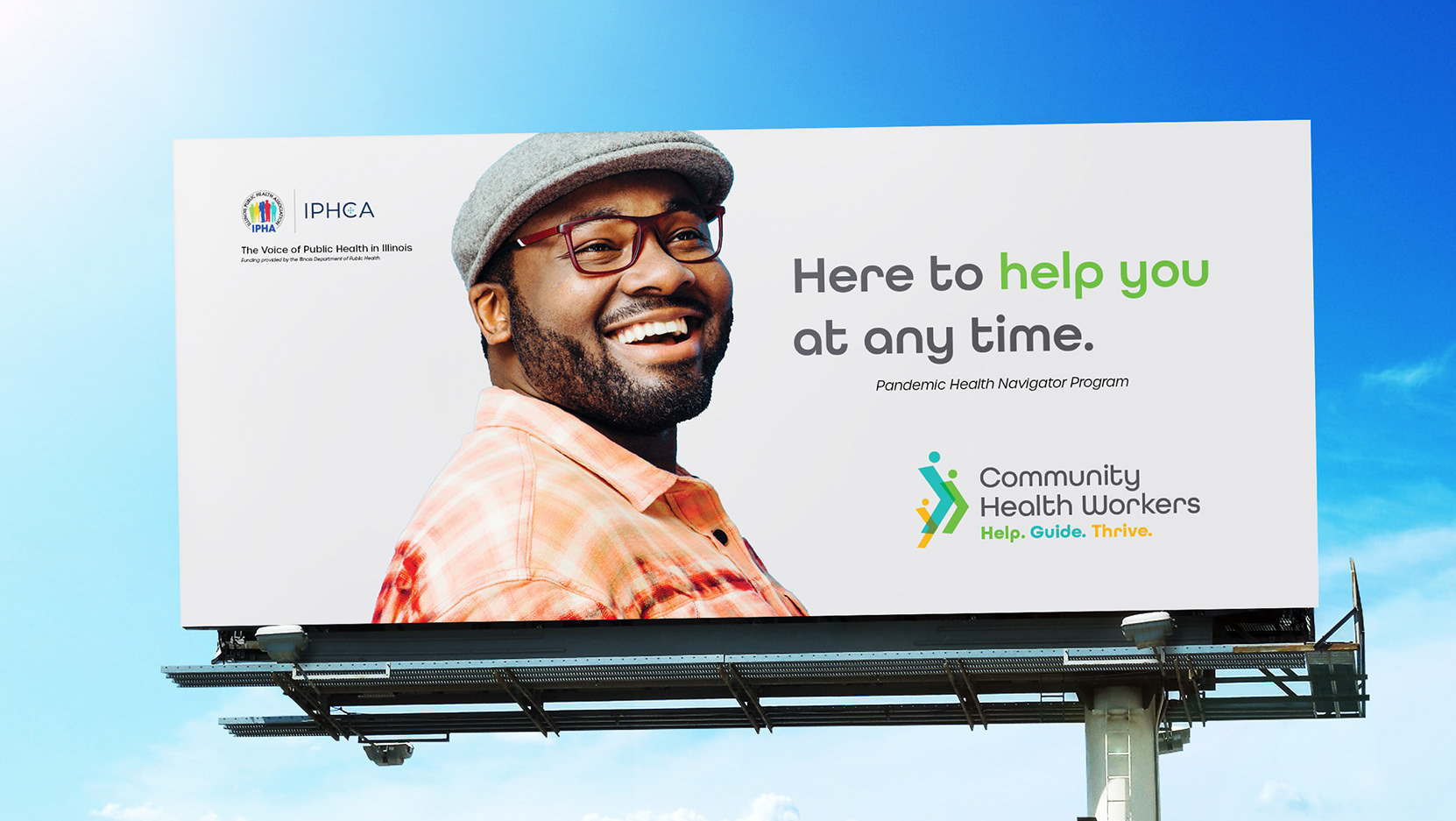
Client: Illinois Department of Public Health
I was brought on to create a campaign brand (logo, tagline, brand guideline, and subsequent materials) for this state-run program in which individuals will be going into the hardest hit areas of the state or Illinois to be there to help them through the pandemic with the resources from food and shelter to get the healthcare they need from a trusted source, someone from their community.