As the creative director on our team, I take pride in leading and actively contributing to the development of concepts and presentations. Our recent project involved creating a new brand, complete with a fresh logo and creative brand positioning across print, digital, and packaging channels, catering to both B2B and B2C audiences.
The logo design, inspired by the DNA molecule abstracted into six parts, symbolizes the six core components of our client's program. This strategic approach highlights how understanding our DNA translates into a personalized weight loss program from a clinical perspective.
Guiding our creative team, we crafted a brand system that explores the six facets of the brand, ensuring alignment with both B2B and B2C customers. By utilizing unique patterns derived from the logo and the six core elements, we provided our client, Lindora, with a diverse range of visual assets to enrich their brand narrative.
Our ability to innovate and develop fresh patterns, tailored for specific B2B and B2C applications, equips Lindora with a dynamic visual toolkit to maintain a contemporary brand image.
Concept: Daily affirmations for the Lindora App | We all need encouragement during our weight loss journey. Short, clear messages that align with the Lindora brand colors are now available to keep you focused and motivated every day. Experience the Lindora brand in a new light through these uplifting affirmations.
Pattern system | Pattern system | Leveraging a logo to create endless patterns provides a wealth of content to categorize products and employ different colors. This visual branding strategy systemizes and organizes various products, from packaging to decor and shopping bags.
I developed a product line for Lindora, spanning from juices to grab-and-go snacks. The clear glass bottles I selected were intentional, aiming to provide a visual representation of their vibrant colors. By incorporating clear labeling with the word "nourish," I enhanced the packaging to showcase both the product and its benefits effectively.
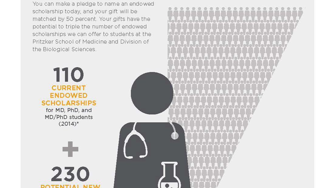
B2B brochure | My recommendation was to transform weight loss data into relatable infographics, prioritizing a human touch. By blending stock illustrations with custom tweaks, I crafted charts
that felt more personal and genuine. Transitioning from solid to outlines conveyed the before-and-after journey, while hand-drawn pie charts added a more human touch. I felt it was important we leaned into the human feel since the weight loss program was specific to each individual's
DNA for weight loss.
