Trustbridge Rebrand
We were tasked to take the new name TRUSTBRIDGE and help engage the internal staff as well as the external audience to come up with a new logo and creative brand strategy. TRUSTBRIDGE's focus is on hospice, palliative care, and home health care. To create a vibrant presence that showed the unique culture of care that they beyond a job for the staff and the patients.
Logo concept
Led the creative team from the logo creation and tagline. I felt very strongly that the tagline be handwritten "Your Life. Our Passion." Real handwriting and not a computer-generated font. This idea then translated to all the other headline typography that was handwritten to show the personal uniqueness of each patient, how they touched the lives of the caregivers, and vice versa. I chose words that captured those authentic moments that Trustbridge helps its patients regain and create new memories in their new normal.
Led the creative team from the logo creation and tagline. I felt very strongly that the tagline be handwritten "Your Life. Our Passion." Real handwriting and not a computer-generated font. This idea then translated to all the other headline typography that was handwritten to show the personal uniqueness of each patient, how they touched the lives of the caregivers, and vice versa. I chose words that captured those authentic moments that Trustbridge helps its patients regain and create new memories in their new normal.
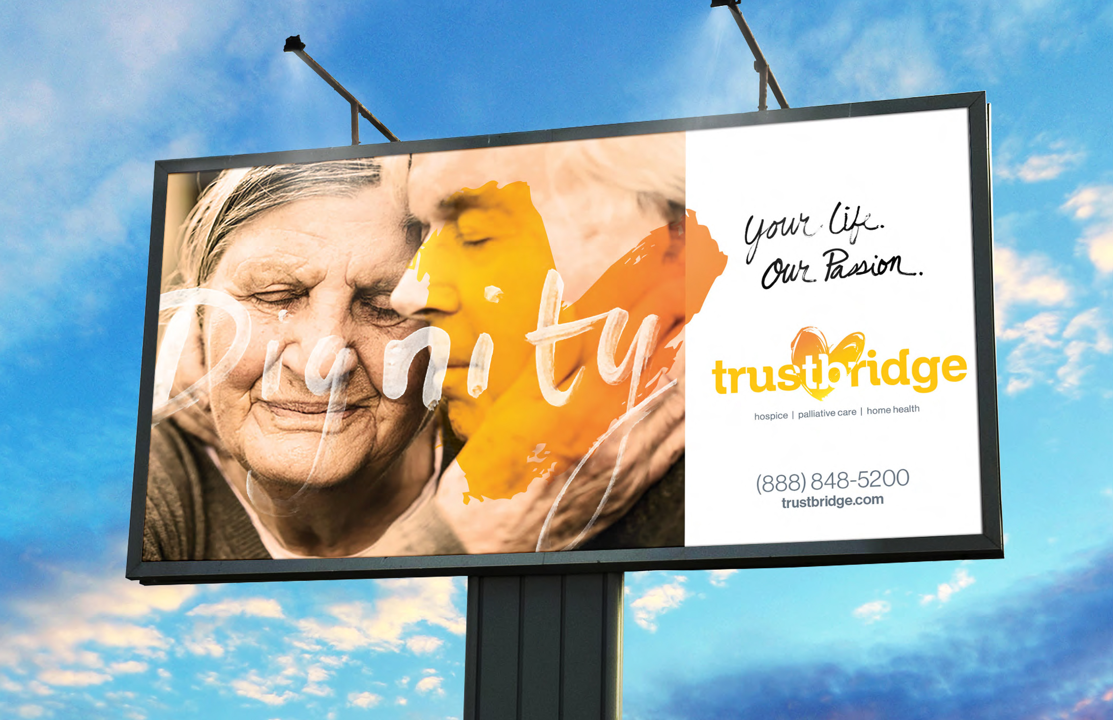
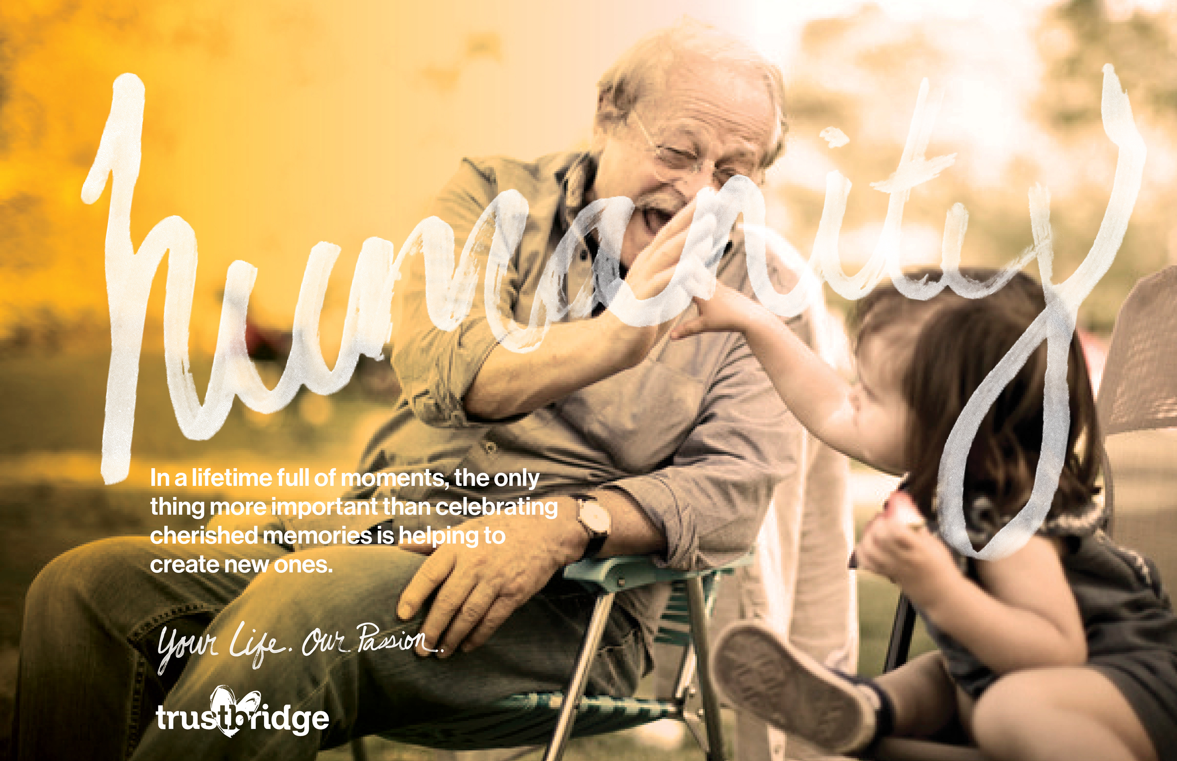
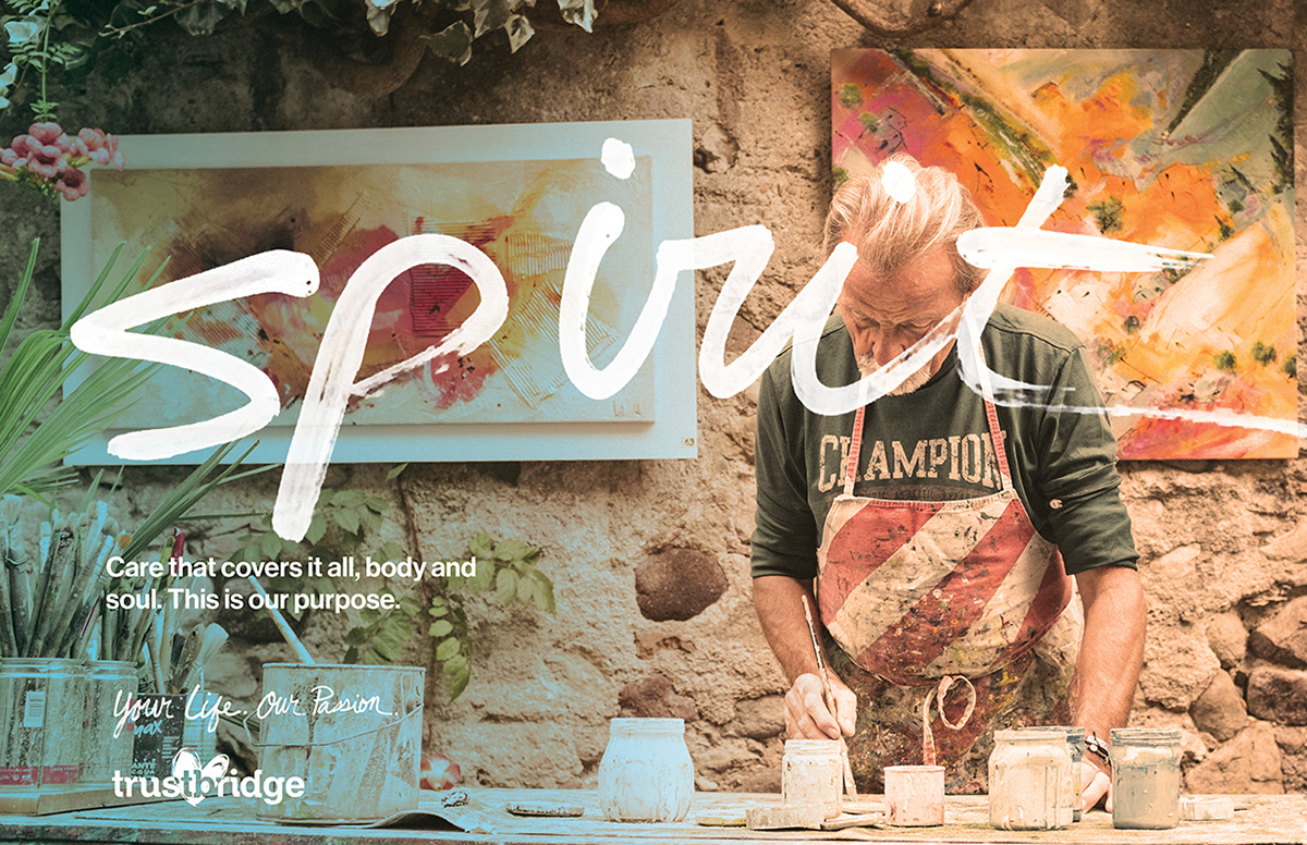
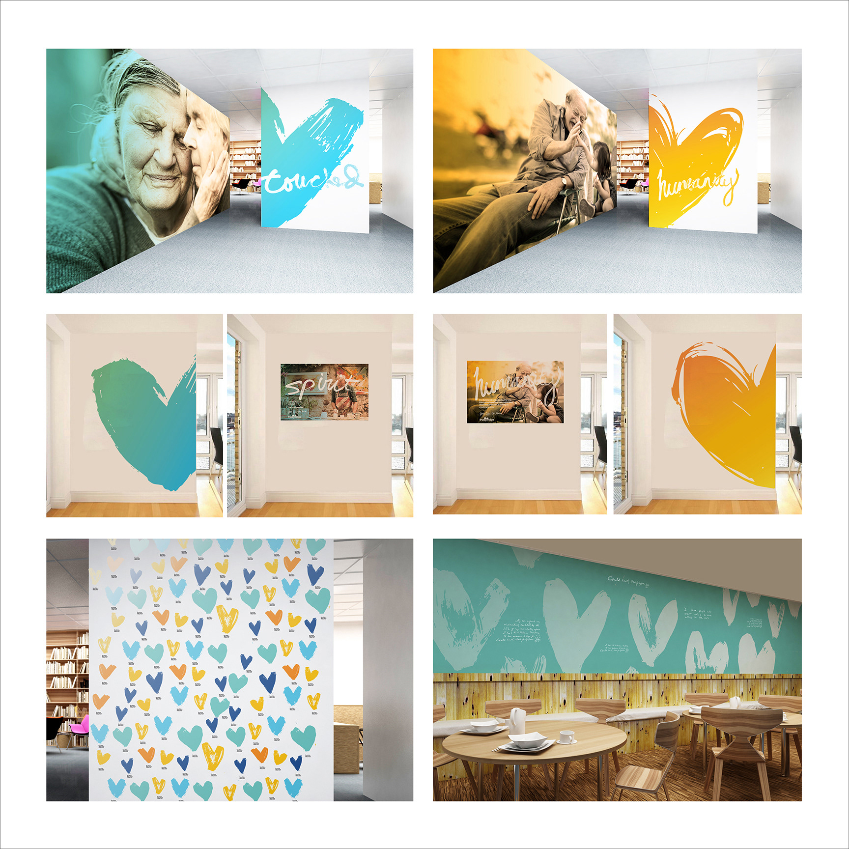
Billboard series (external ad concepts)
These ads focused on the moments and the touchpoints of Trustbridge and its patients. I purposefully hand-painted each of the words and chose words that gave back those moments to Trustbridge's patients. All the imagery focused on where the "hand" is the conduit and the "heart" icon overlays to show that emotional connection.
These ads focused on the moments and the touchpoints of Trustbridge and its patients. I purposefully hand-painted each of the words and chose words that gave back those moments to Trustbridge's patients. All the imagery focused on where the "hand" is the conduit and the "heart" icon overlays to show that emotional connection.
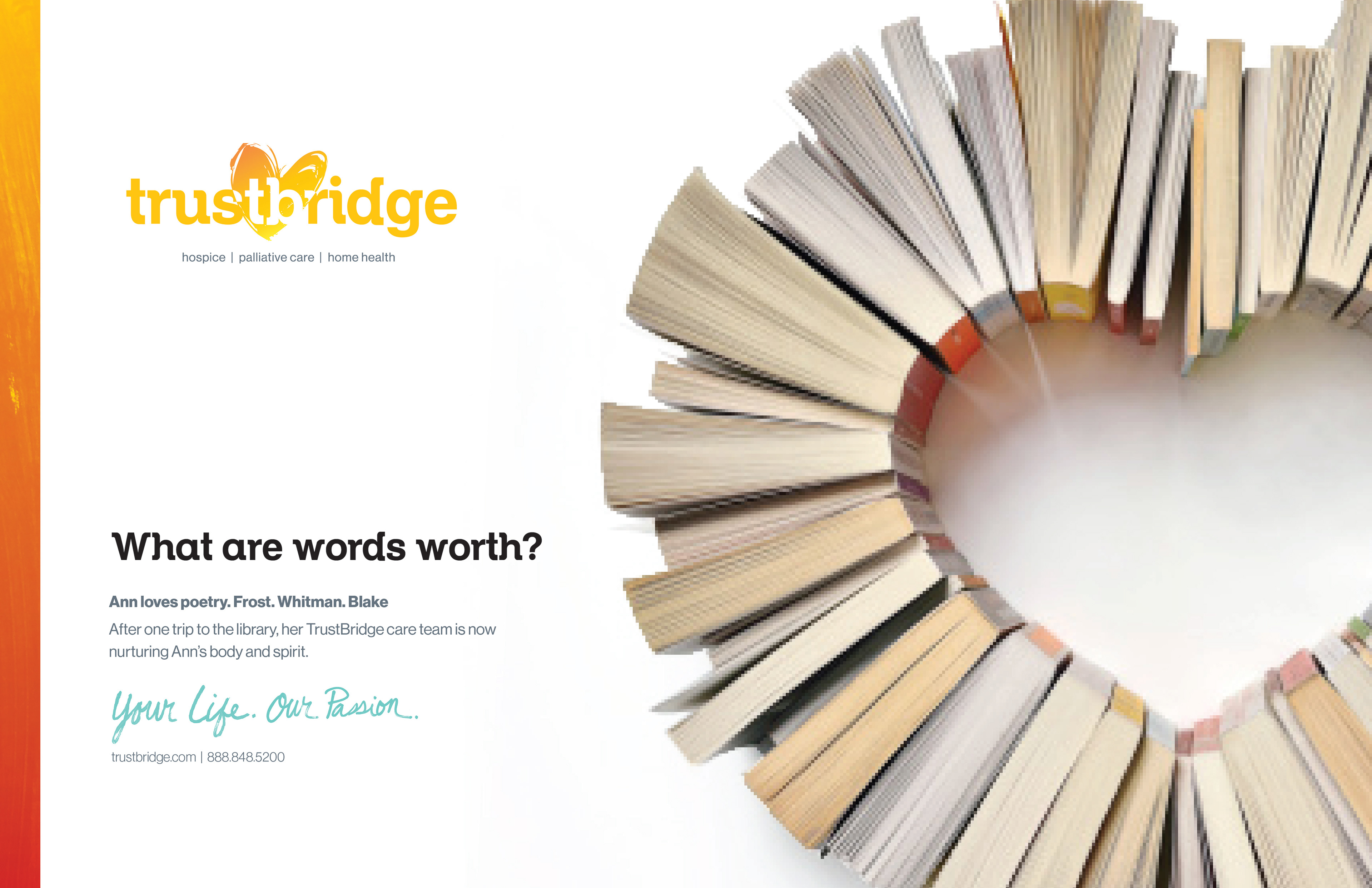
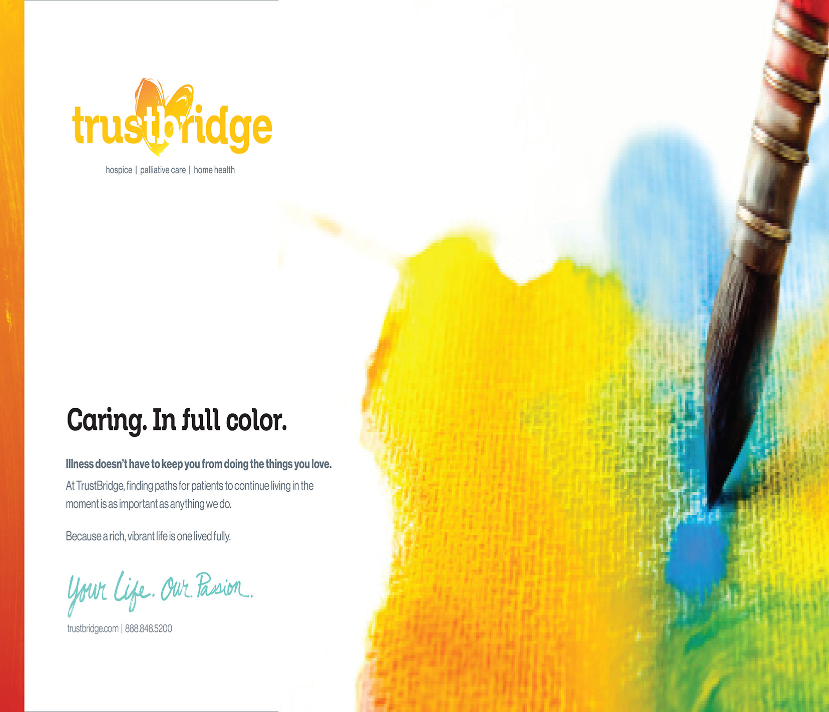
Advertising campaign concepts (external audience)
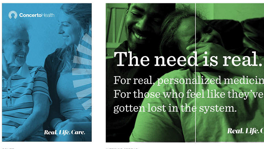
To extend the reach of the "heart" from the logo, to make it a living, breathing entity that went beyond the logo, I had the idea of the different touch-points and interactions the staff of Turstbridge would have with their patients. These one-on-one moments of connection translated to "implied heart" in the physical manifestations of each ad which showed the depth of caring the staff had for their patients and the bonds they created with their patients.
To extend the reach of the "heart" from the logo, to make it a living, breathing entity that went beyond the logo, I had the idea of the different touch-points and interactions the staff of Turstbridge would have with their patients. These one-on-one moments of connection translated to "implied heart" in the physical manifestations of each ad which showed the depth of caring the staff had for their patients and the bonds they created with their patients.
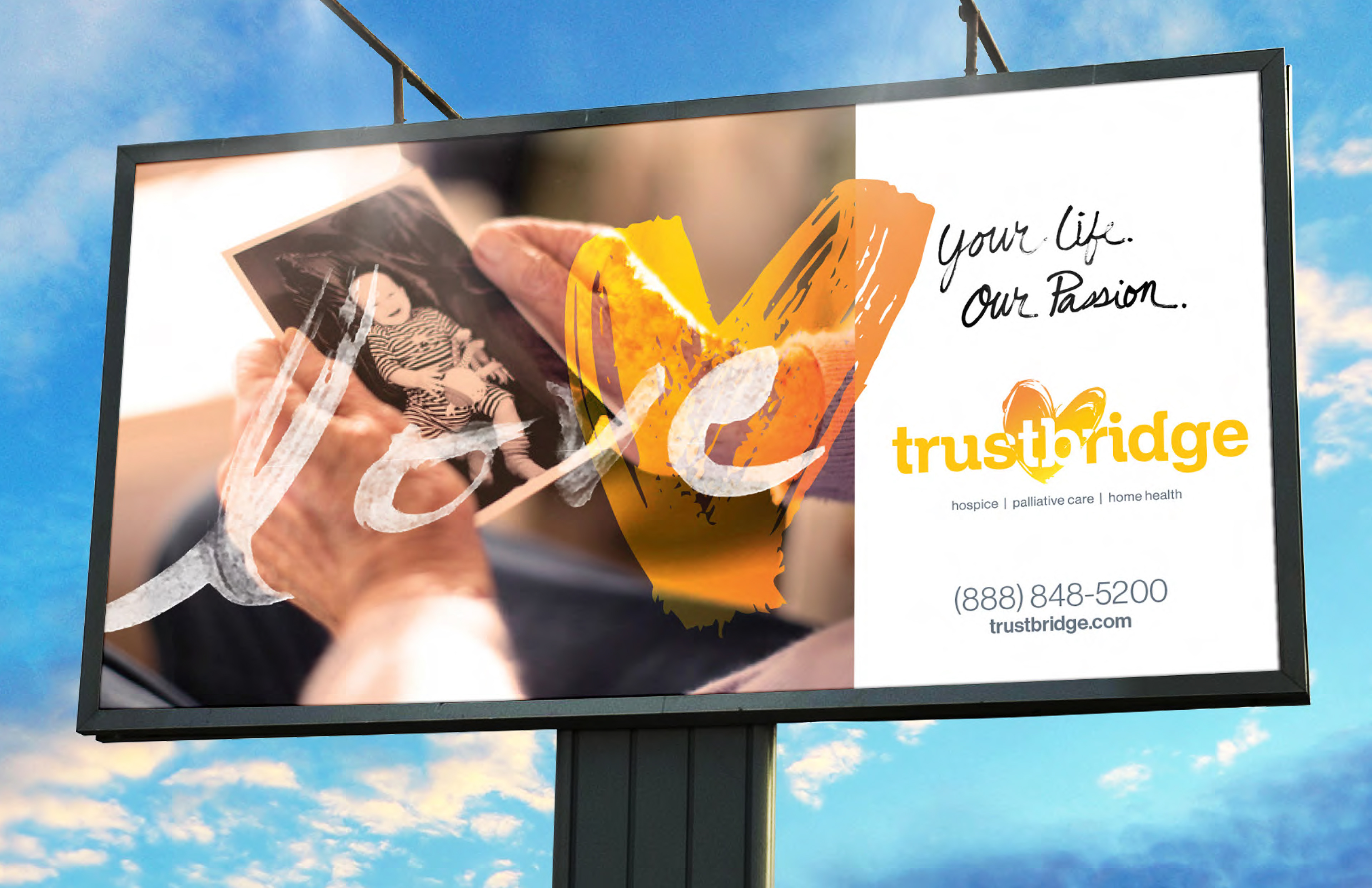
Billboard series (external ad concepts): These ads focused on the moments and the touchpoints of Trustbridge and their patients. I purposefully hand-painted each of the words and chose words that gave back those moments to Trustbridge's patients. All the imagery focused on where the "hand" is the conduit and the "heart" icon overlays to show that emotional connection.
External ads were created that all had real moments the staff provided. Every ad was to have a "heart" implied someplace to tie back into the brand.
External poster series. Focusing on the "new normal" to bring the patients joy again.
Environmental concepts.